Redesigning the Dashboard Experience to Improve overall machine utilization upto ~25 %
Redesigning the Dashboard Experience to Improve overall machine utilization upto ~25 %
Redesigning the Dashboard Experience to Improve overall machine utilization upto ~25 %
KPI Dashboard
My Role
User Research: Competitive Analysis, Data Analysis
UX Design: Sketching, Interaction Design, Prototyping.
User Research: Competitive Analysis, Data Analysis
UX Design: Sketching, Interaction Design, Prototyping.
Team
Product Designer
Product Manager
Senior Designer
Engineers
Product Designer
Product Manager
Senior Designer
Engineers
Timeline
2 months
Background
In January 2024, AVL recognized that their customer is trying to access and view large volume of data and graphs and they were not able to fully uncover the insights based on the given data on the dashboard.
I Explored the designs on various touchpoints in the application and we were provided with some reference, based on customer feedback.
But what is this KPI Dashboard ?
KPI Dashboard is a platform for users to track machine efficiency in their plants facility.
Plant Managers see trends and analysis to determine if sometime is wrong.
They also create future plans for the plant facility based on the data.
Problem Breakdown
So what went wrong ?
Difficulty in discovery, navigation and visualization of important metrics were uncovered by the users as per the reports from KPI Dashboard.
Difficulty in discovering Metrics
Problem in revealing important insights
It all started with after having conversation with the customer feedback department, Here's what I found out :
The users were not able to analyse the root cause for their decreasing utilization rate based on the existing data.
User's not able to communicate Service-Level Expectations for their production with their customers.
Users know what result they want to see and what parameters to provide, but fail to do so, Wasting their valuable time.
Design in action
So what to do about this ?
Based on the given problem, I brainstormed and mapped out the following design goals, so that my aim is laser focus on priortizing and solving the right kind of problems.
My Approach
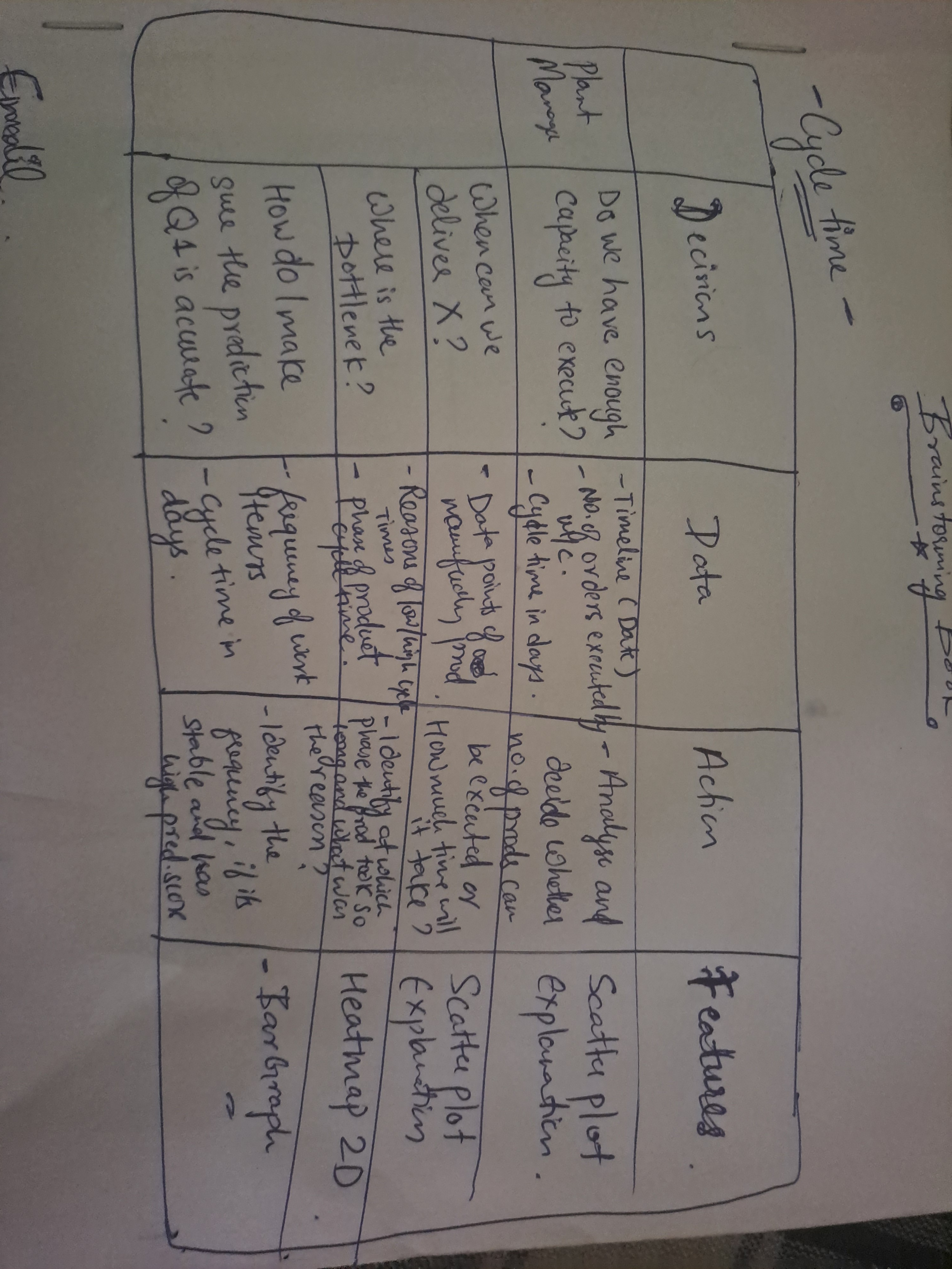
To help user achieve these design goals, I mapped out a decision table matrix, where-in I was able to decide what kind of design changes is needed based on the user decisions.
- Identification and validation of problem.
- Define design goals.
- Analyze the KPI data and Identify crucial decisions made by the user.
- Ideate on navigation and Interaction
- Map out Decision matrix for KPI.
- Finalize the Presentation layer (Visual Design)
Design Goals
#1
Simplify the navigation for better discovery.
#2
Help user view what they want to see (Insights).
#3
Help user embrace the app structure (mental model).
Through this, I was able to identify important metrics and why were necessary for our users and what type of thing would they usually want to see which in turn would reveal promising results to improve the machine productivity.
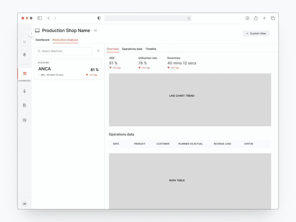
Design Explorations
I revamped the Dashboard section to provide a smart list of all machine elements, which the user can categorise using filters.
But I will show my few of the contesting explorations which were done after few short iterations.
Exploration # 1
This section shows machine lists that allows user to identify lowest utilization rate and allows user to explores the significant metrics for better analysis.
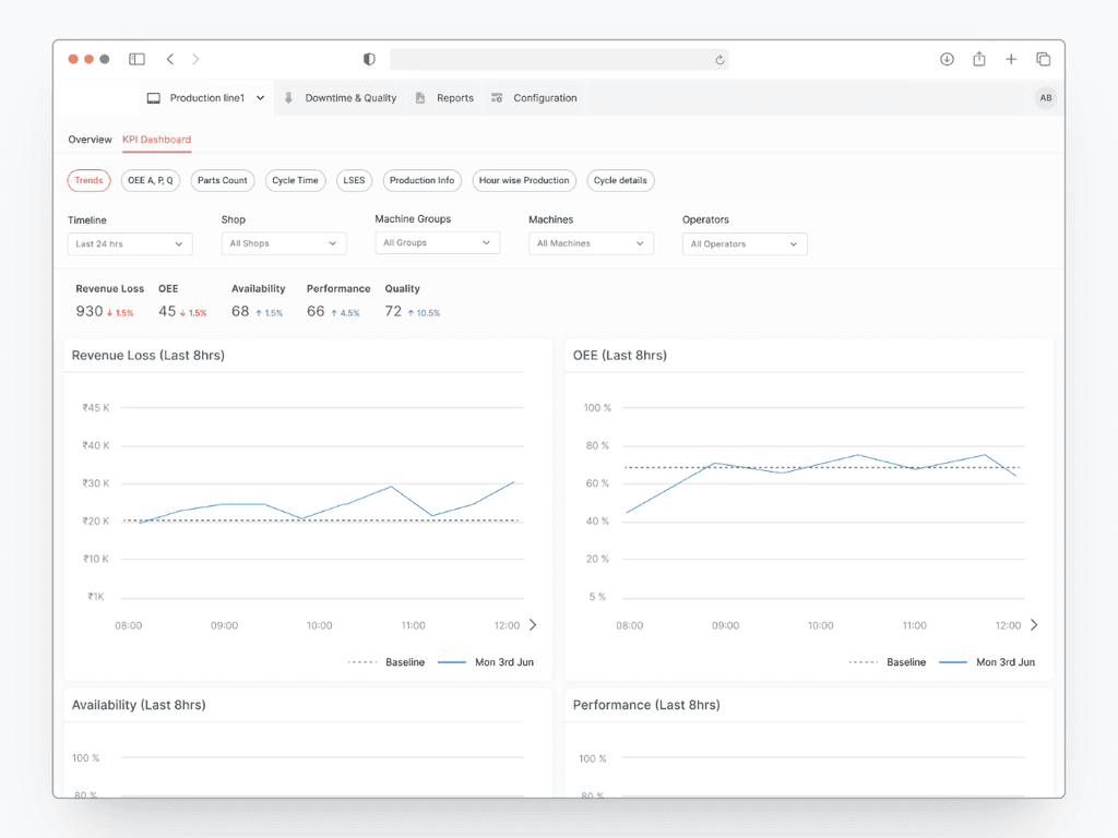
Exploration # 2
Filters are engaged with Machines, Machine shops and other data points that intelligently adjusts to display results for a particular category.
In this exploration, Effective re-categorization of important metrics was done to ensure better effectiveness on insights gathering.
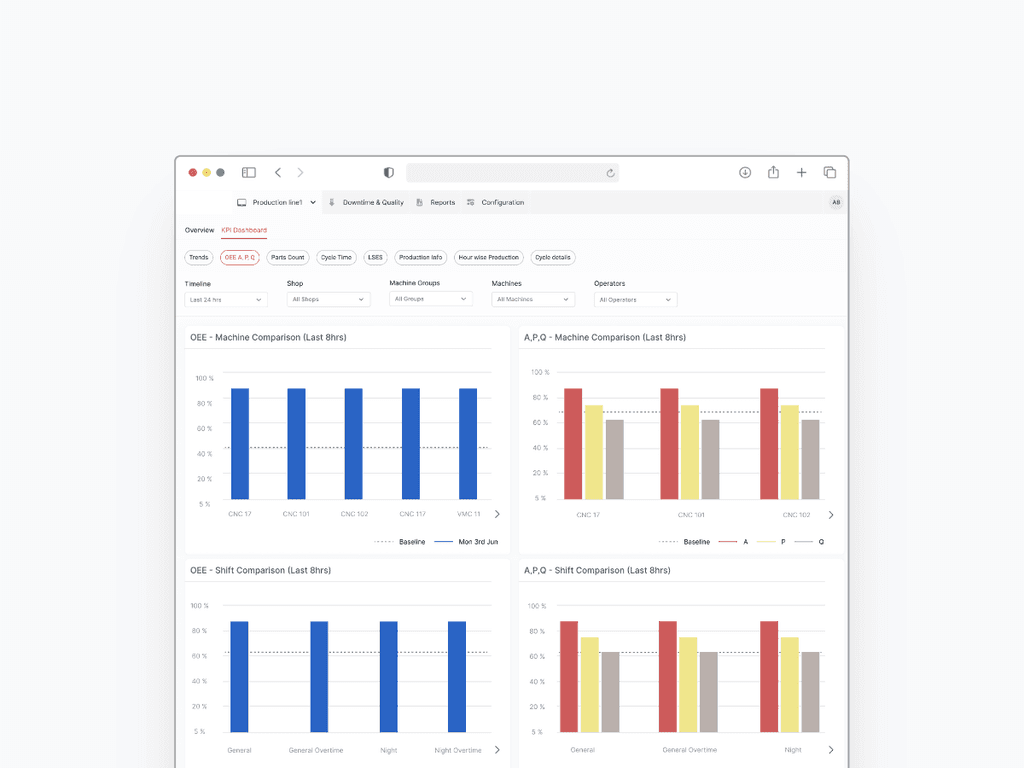
Exploration # 3
On the first level, all important metrics are shown on a machine level to ensure better priorisation of machines and effective understandability of system status.
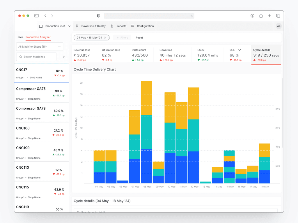
To ensure a granular and deeper analysis, a detailed tabular view is suggested on every associated data graphs.
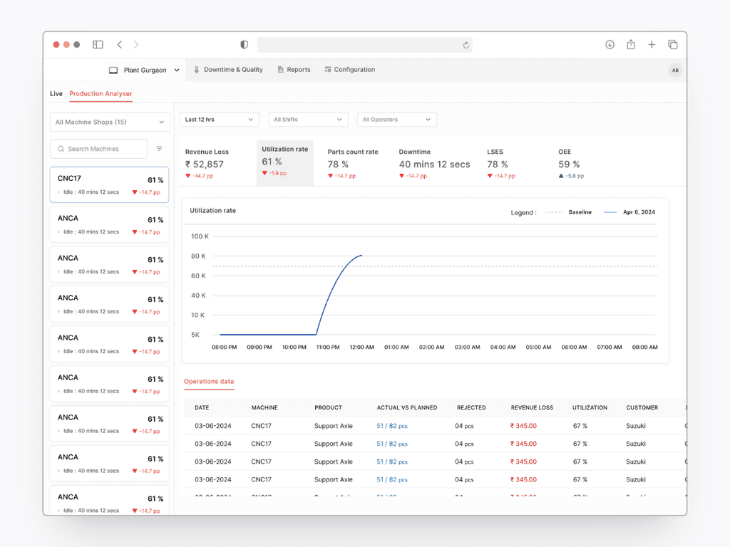
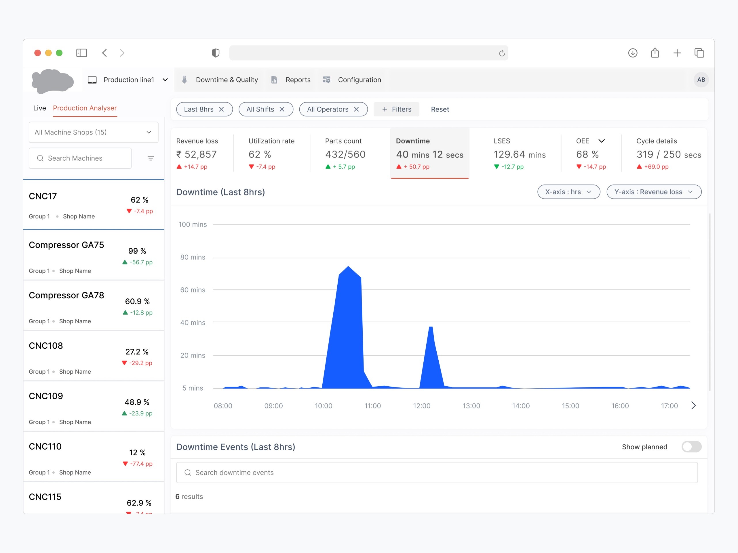
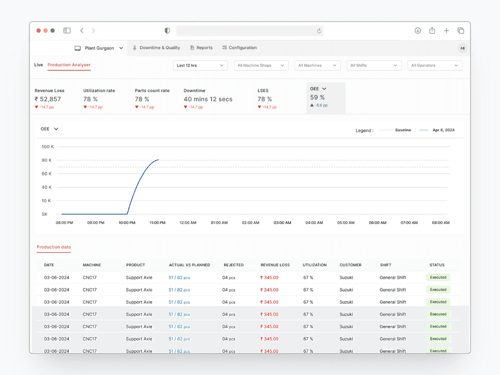
Final Solution
Machine list enables the users to spot in-efficient machine. This helps users focus on the most relevant areas and analyze production data to uncover hidden capacity further.
Users can instantly spot underutilized machines by scanning for low percentage utilization rates and red indicators. For example, a machine with a utilization rate of 27.2% (CNC108) and a red arrow down (-29.2 pp) is clearly underutilized and has seen a significant drop in usage.
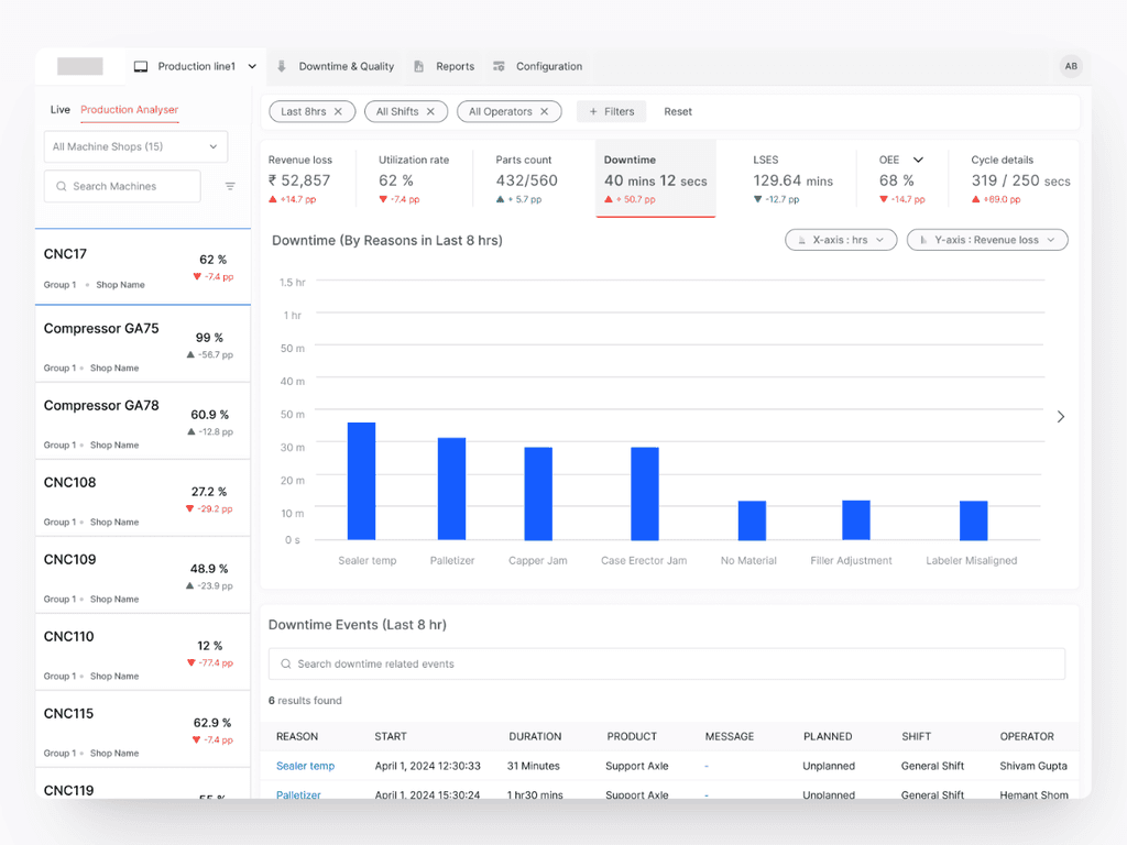
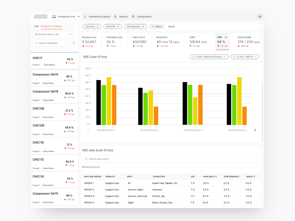
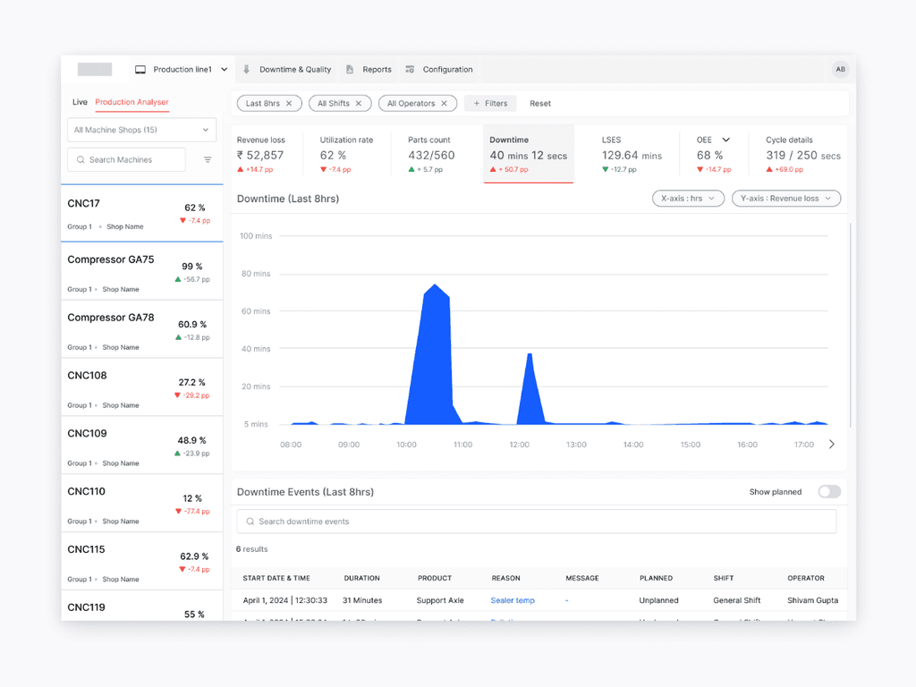
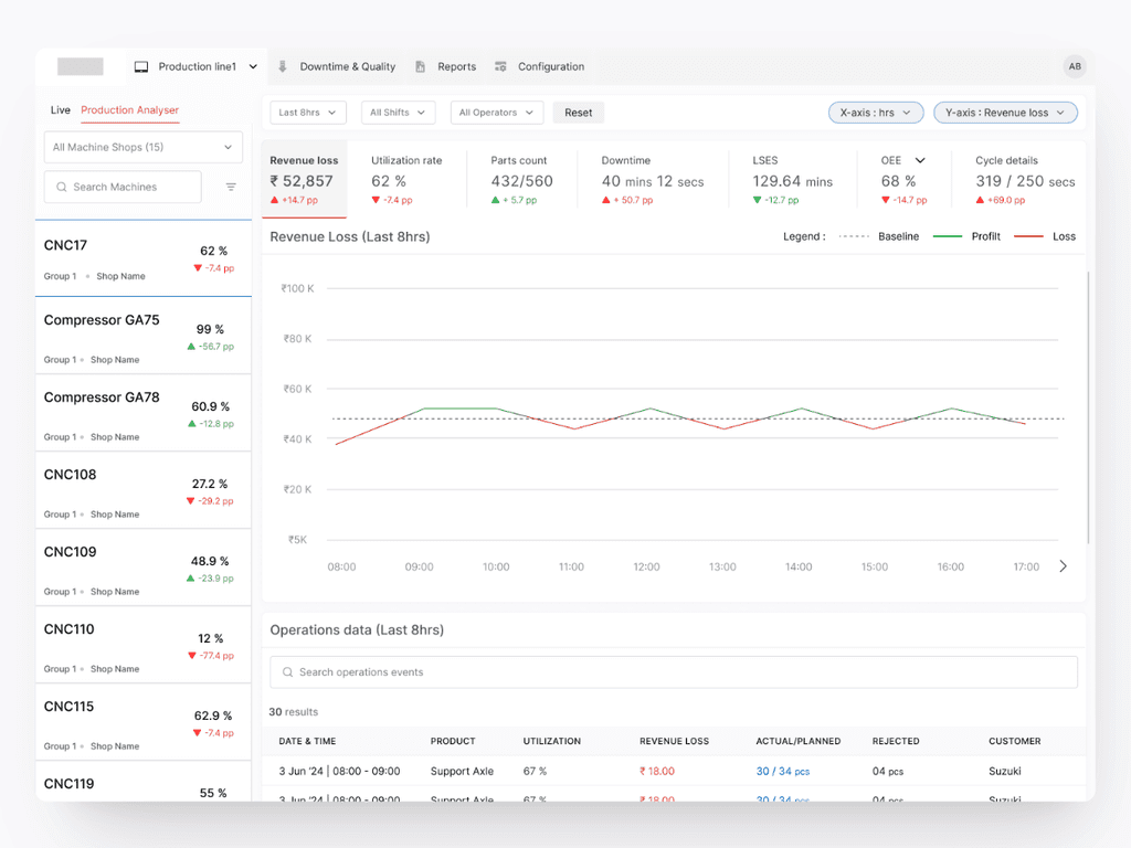
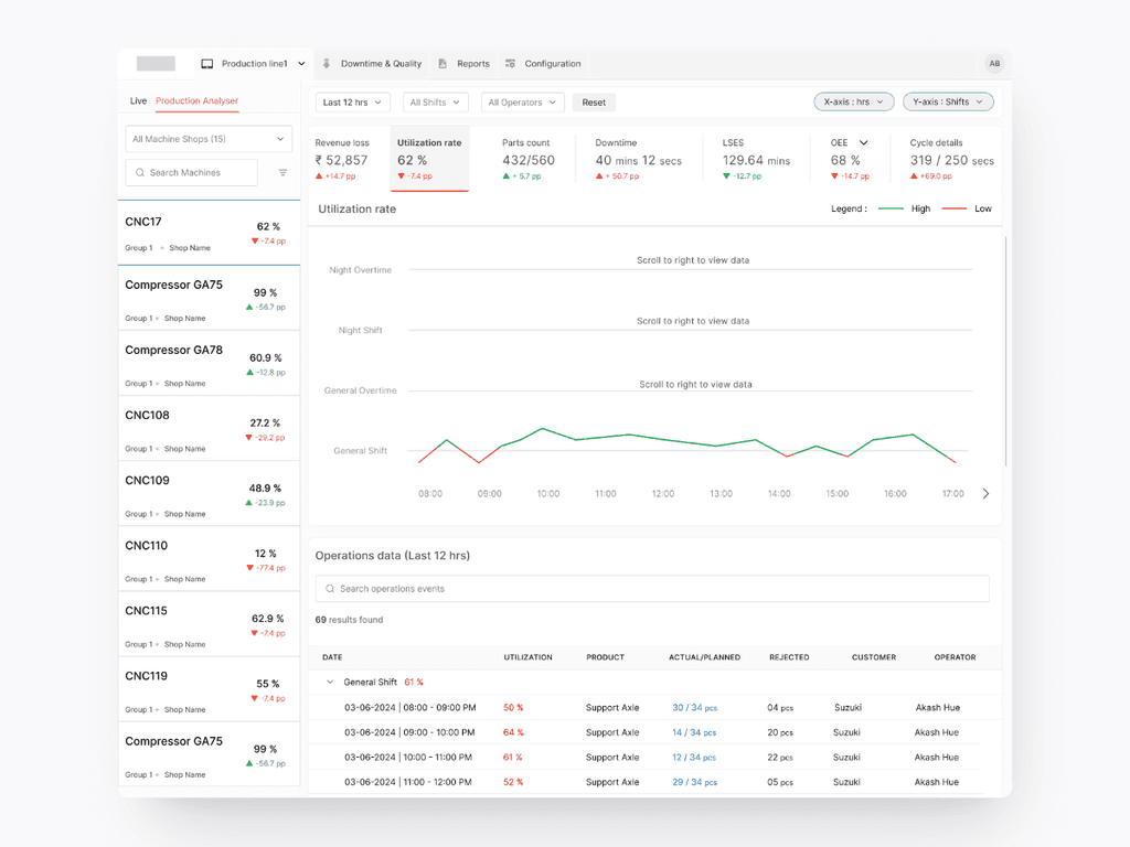
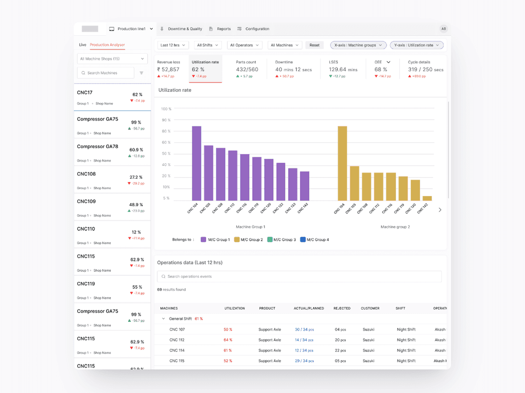
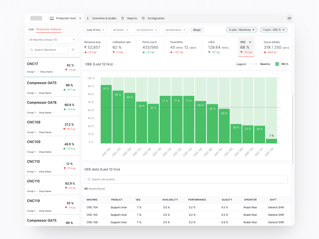
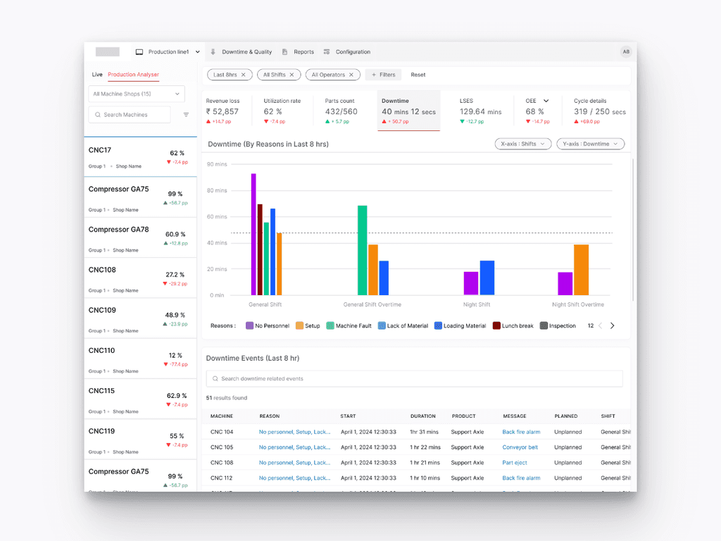
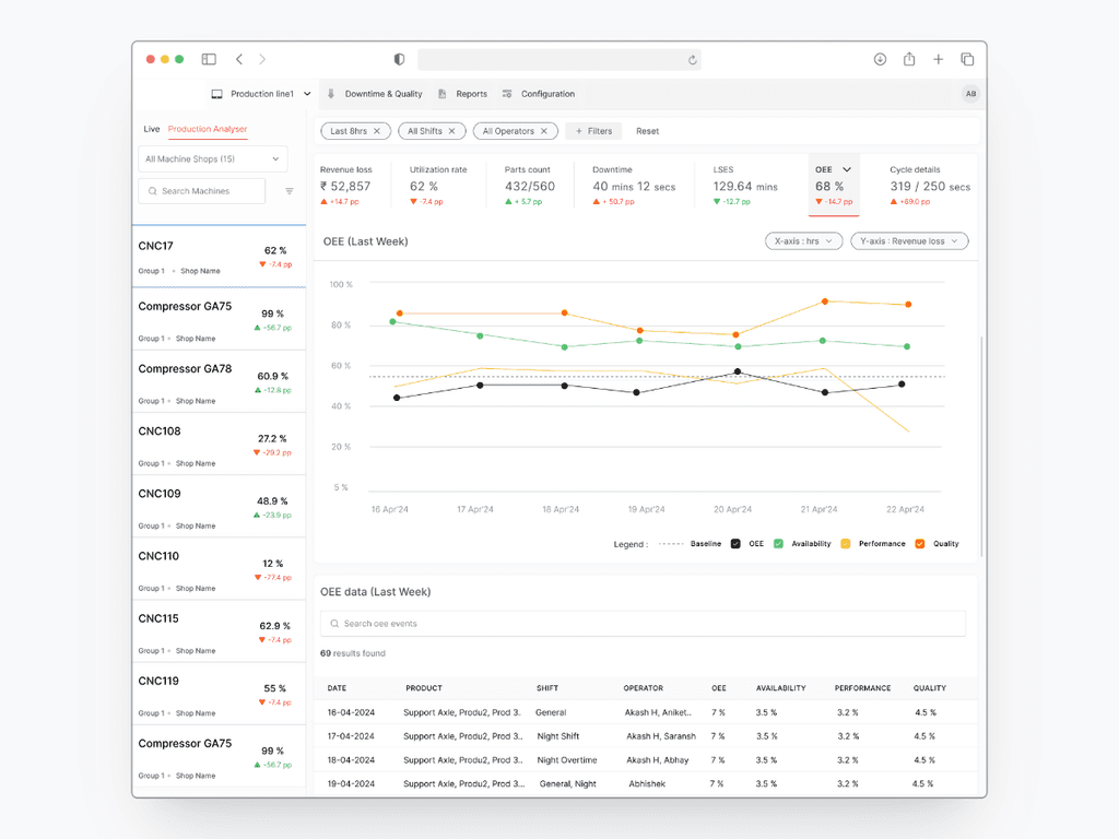
The primary part of the screen uses bar graphs to visualize downtime reasons across different shifts, making it easier for users to see patterns and identify problem areas quickly. The graph has flexible X and Y parameters (e.g., Hours vs. Revenue Loss), allowing users to customize the view based on their specific queries.
Filters at the top of the screen enable users to narrow down data by time frame (e.g., last 8 hours), shifts, operators, and other relevant criteria. This interaction allows for more targeted analysis.
Other Features
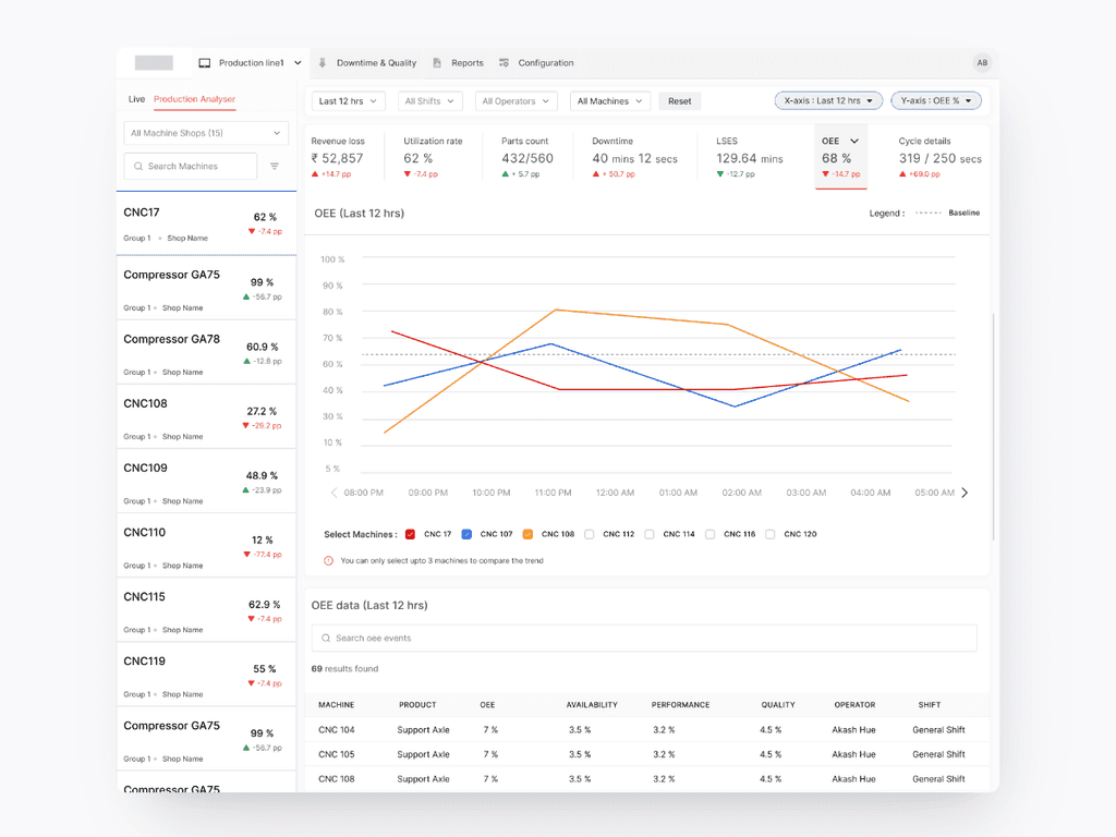
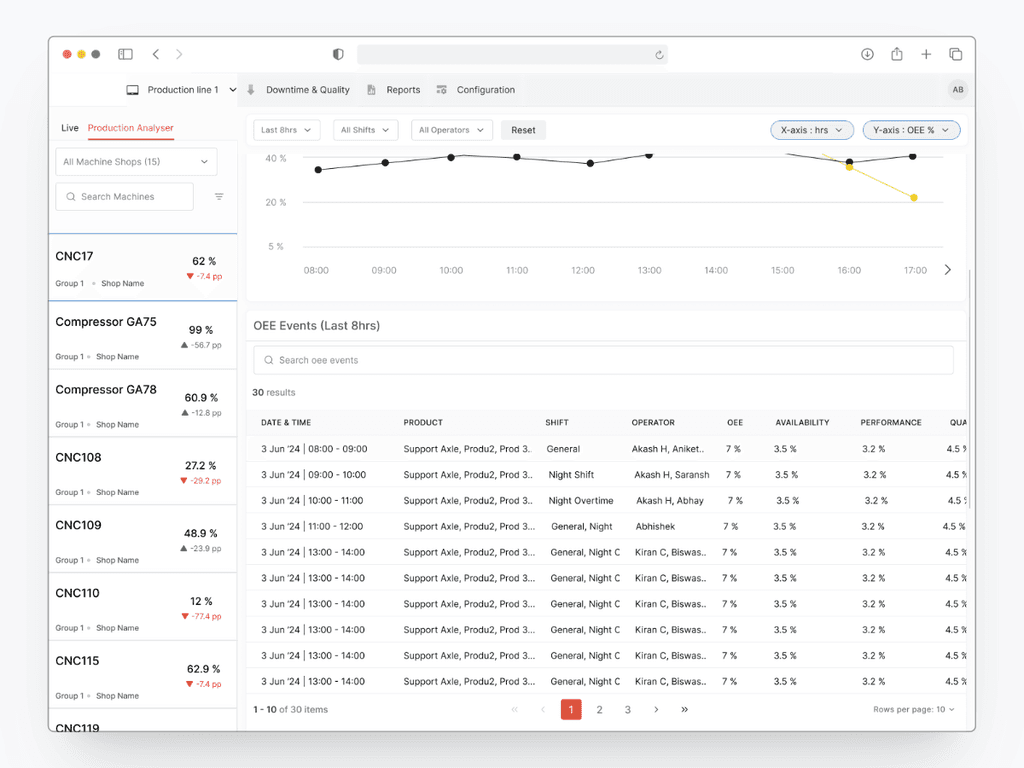
We needed to ensure that customers can communicate SLEs (service level expectations) with their customer (internal or external) when a specific work item will be done.
To Solve for this, two x-axes graph communicates the probability of completing tasks within a specific time frame.
For instance, if the 50th percentile line corresponds to 5 days, user can confidently communicate to their customers that there's a 50% chance of delivering a task within 5 days. Similarly, the 80th percentile might show a higher cycle time, providing a more conservative estimate.
Signing off
This project involved a lot of effort, exploring new ideas, and talking with people who have a stake in it. It was especially fun working on the data visualization part. Let's see how this impacted our users.
The Impact
Improved Machine Visibility, leading to saving the wasted time spent on finding the right path.
No. of Good parts increased by ~5000 nos.
Increase in Machine Utilization rate by 25%, leading to effectively utilize machines.
Identification of bottle necks and meeting SLE's for their customers leads to positive customer feedback.
Key Learnings
Don't be afraid of incorporating inspirations at latter stage.
Best Ideas can emerge anytime.
Don't get overwhelm by exploration, optimization is a key to success.
Copyright © 2024 Akash Bisht. This website was developed in Framer.
आप सभी से निवेदन है कि इसे डेस्कटॉप मोड में खोलें।
You all are requested to open this in desktop mode.
ನೀವು ಎಲ್ಲರೂ ಡೆಸ್ಕ್ಟಾಪ್ ಮೋಡ್ನಲ್ಲಿ ತೆರೆಯುವಂತೆ ವಿನಂತಿಸುತ್ತೇನೆ।
तुमका सगळ्यांनी विनंती आसा की ह्या डेस्कटॉप मोडात उघडप।
আপনাদের সকলের প্রতি অনুরোধ, এটি ডেস্কটপ মোডে খুলুন।
تُہند روزانہ اہش پیٹھہ زاری وچھتہ بزو تہ تِہ ہَندہ ڈیسک ٹاپ موڈِہ پر تہاو۔
आपण सर्वांना विनंती आहे की हे डेस्कटॉप मोडमध्ये उघडा।
ਤੁਹਾਡੇ ਸਾਰੇ ਲਈ ਬੇਨਤੀ ਹੈ ਕਿ ਇਸਨੂੰ ਡੈਸਕਟੌਪ ਮੋਡ ਵਿੱਚ ਖੋਲ੍ਹੋ।
توهان سڀني کي گذارش آهي ته هن کي ڊيسڪٽاپ موڊ ۾ کوليو
நீங்கள் அனைவரும் இதை டெஸ்க்டாப் முறையில் திறக்குமாறு கேட்டுக்கொள்கிறேன்
మీరు అందరూ దీన్ని డెస్క్టాప్ మోడ్లో తెరవమని వినతిచేస్తున్నాను
সকলকো অনুরোধ করছি ইয়াকে ডেস্কটপ মোডে খুলতে।
ଆପଣମାନଙ୍କ ସବୁଙ୍କୁ ଅନୁରୋଧ ଯେ, ଏହାକୁ ଡେସ୍କଟପ୍ ମୋଡ୍ରେ ଖୋଲନ୍ତୁ।
આપ સર્વને વિનંતી છે કે આને ડેસ્કટોપ મોડમાં ખોલો।
আপোনালোক সকলোকে অনুৰোধ জনাইছোঁ যে ইয়াক ডেস্কটপ মোডত খোলক।
Connect with Me!
akashbisht.designs@gmail.com
Copy Email